
So, what is a typeface, really? Many people still mix up the term with font, even though they’re not the same thing. In design and typography, a typeface refers to the artistic style of letter shapes, while a font refers to a specific version of that style such as its weight, size, or format. Once you understand typefaces, choosing the right visual voice for a brand becomes much easier.
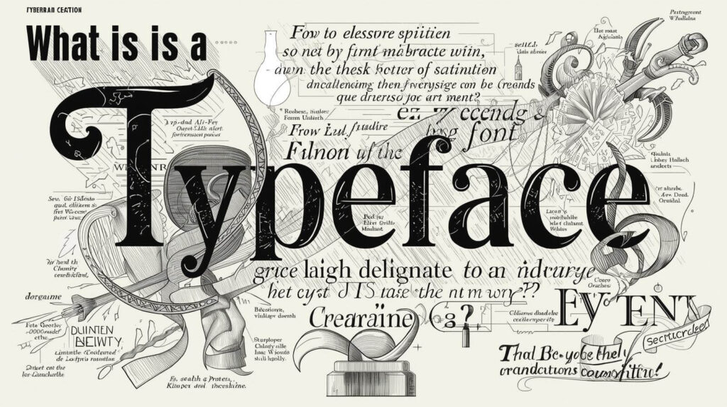
🟢 What Is a Typeface: Understanding Its Meaning
A typeface is the overall design or style of a set of letters, numbers, and symbols that creates a visual identity for written text.
It represents the artistic structure of letterforms — whether they feel modern, classic, soft, bold, minimalistic, elegant, or playful.
Common examples of typefaces include:
- Helvetica
- Times New Roman
- Garamond
- Futura
- Poppins
- Montserrat
Each one carries its own unique visual personality.
For example:
- Times New Roman feels traditional and formal
- Poppins feels modern, friendly, and clean
According to Wikipedia, it is defined as the visual design of a collection of characters that share a consistent stylistic appearance across letters, numbers, and symbols. (source: Wikipedia – Typography).
🟢 Difference Between Typeface and Font
A simple explanation:
| Typeface | Font |
|---|---|
| The design/style of letterforms | The specific file, weight, or size |
| Example: Poppins | Poppins Bold 16px, Poppins Light 12px, Poppins Italic 24px |
| Conceptual design | Technical implementation |
Think of it like music:
- The song composition = Typeface
- The MP3 320kbps or WAV file = Font
So when someone says, “Send me the font Helvetica Bold 14px”, they’re correct.
But saying “I’m using Helvetica font” is technically inaccurate — because Helvetica is a typeface, not a font.
🟢 Why This Difference Matters for Designers
Knowing the difference between typeface and font helps you:
- Communicate more professionally with designers and printing vendors
- Choose visual styles that fit your brand identity
- Avoid production or formatting errors
- Work more efficiently and consistently across platforms
If you’re developing brand identity, the style you choose shapes how your brand speaks visually., while font files determine consistency across usage formats — posters, packaging, websites, and mobile apps.
🟢 Examples That Show Typeface vs Font in Real Use
Branding Example
A company selects Montserrat as its branding typeface.
In different design elements, they use:
- Montserrat Bold for titles
- Montserrat Regular for body text
- Montserrat SemiBold for subheadings
👉 Montserrat (the family) = Typeface
👉 Bold, Regular, and SemiBold in various sizes = Fonts
Web & UI Example
A website may use:
- Poppins for headings
- Inter for paragraph content
Within the UI files, the actual fonts may include:
- Poppins ExtraBold 48px
- Inter Regular 18px
🟢 How to Choose the Right Typeface for Your Brand
1. Match the brand’s character
A creative outdoor brand might use a bold or slightly rustic typeface.
For example, an adventure-themed business like Green Adventure Studio would benefit from modern, clean, yet natural-looking typefaces.
2. Prioritize readability
A beautiful typeface is useless if readers struggle to understand it — especially for long text.
3. Limit yourself to 2–3 typefaces
More than that usually makes design messy.
4. Check licensing
Never assume a typeface is free. Some are free only for personal use, not commercial use.
🔗 Recommended font resources:
- Google Fonts — https://fonts.google.com
- MyFonts — https://www.myfonts.com/
Want to learn how to select fonts that align with brand identity?
Read this next:
👉 How to Choose Fonts for Branding or Explore premium & creative letter styles for your brand: Browse Fonts
🟢 Conclusion
- A typeface is the design style of a family of characters.
- A font is a specific weight, size, or file variation within that typeface.
Understanding this difference helps you communicate more clearly, design more professionally, and make more confident creative decisions.
Typography is more than shapes of letters — it’s a visual language that expresses tone, emotion, and identity without speaking a word.