
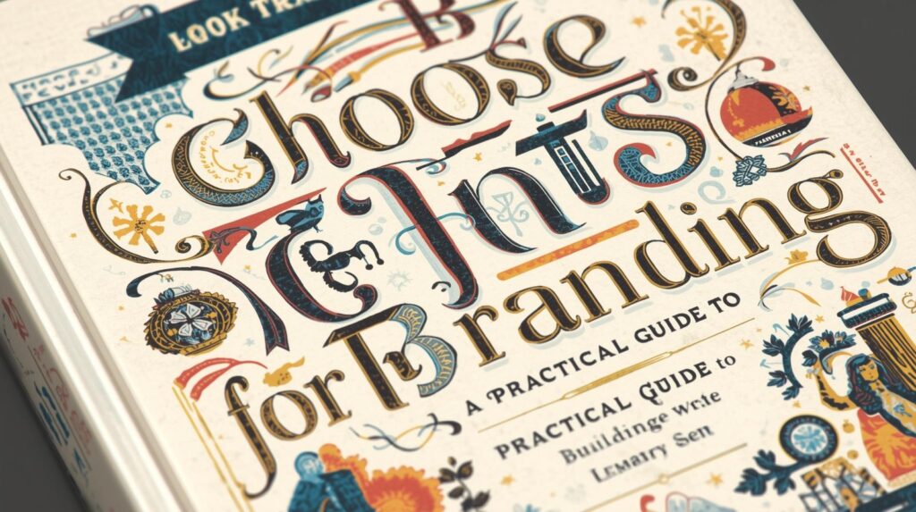
Understanding How to Choose Fonts for Branding is one of the most essential steps in building a professional and memorable brand identity. Fonts are more than just letters; they communicate personality, tone, and emotions before people even read a single word. With the right font choice, your brand can feel trustworthy, bold, elegant, playful, or cutting-edge—all through visual language.
Why Fonts Matter in Branding
Typography plays a significant role in shaping how people perceive a brand. Research shows that 93% of purchase decisions are influenced by visual impressions, meaning fonts directly impact trust and emotional connection.
Fonts influence:
- First impressions of a brand
- Brand memorability and recognition
- The tone of communication—formal, casual, modern, or classic
- User experience and readability across media
If you want to better understand the fundamentals of typefaces before choosing brand fonts, you may want to read this article about What Is Typeface and The Difference From Font as supporting knowledge.
1. Define Brand Personality Before Choosing Fonts for Branding
Before browsing hundreds of fonts on Google Fonts, take a moment to define your brand personality. Ask yourself:
- How should my brand feel to the audience?
- Modern or vintage?
- Elegant or playful?
- Minimalist or expressive?
- Serious or friendly?
| Brand Style | Suitable Font Personality |
|---|---|
| Luxury, premium | Serif fonts (Playfair Display, Cormorant, Times New Roman) |
| Modern, clean | Sans serif fonts (Inter, Helvetica, Poppins) |
| Creative & artistic | Display or handwritten typefaces |
| Friendly & casual | Rounded sans serif (Quicksand, Nunito) |
When your brand personality is clear, choosing fonts becomes easier and more consistent.
2. Use 2–3 Fonts for Branding, Not More
Too many fonts create visual noise and confusion. Keep it simple and structured:
- Primary font — for headings & titles
- Secondary font — for paragraphs & body text
- Accent font (optional) — for highlights or quotes
Recommended safe font pairings:
- Playfair Display + Inter
- Poppins + Merriweather
- Montserrat + Lora
- Bebas Neue + Roboto
You can explore automatic font pairing directly from Google Fonts
👉 External link: https://fonts.google.com/
3. Prioritize Readability When Choosing Fonts for Branding
A beautiful font that is hard to read has no value in branding. Readability builds comfort, trust, and clarity.
Tips for readability:
- Body text must be at least 16px
- Heading sizes should start from 28px and above
- Maintain balanced line spacing (120%–150%)
- Avoid ALL CAPS for long sentences
- Ensure strong contrast between text and background colors
Typography is not just about style—it’s about communication.
4. Match Fonts With Mediums & Usage
A good branding font must work well across all platforms where your brand appears: websites, social media, packaging, posters, and even merchandise.
Choose the correct type depending on media:
- Digital UI / Websites — Sans serif fonts are more readable on screens (Inter, Roboto, Open Sans)
- Printed editorial or books — Serif fonts are comfortable for long paragraphs (Lora, Merriweather, Georgia)
- Billboards & signage — Bold geometric sans serif for strong impact
- Fashion & lifestyle branding — High-contrast serif gives elegant vibes
Choose fonts that have multiple weights (thin–bold) and styles (italic, condensed) for flexibility.
5. Check Font Licensing
Never ignore licensing. Many businesses face legal issues for using commercial fonts without the proper license. When selecting fonts, confirm whether they are free for personal use or commercial use.
Recommended safe font sources:
| Free & Legal | Premium |
|---|---|
| Google Fonts | MyFonts |
| Fontshare | Creative Market |
| DaFont (check “Commercial Use Allowed”) | Envato Elements |
Investing in a professional font is worth it—strong branding attracts long-term trust.
6. Test Fonts in Real Design Contexts
Never choose fonts based only on how they look in a preview window. Test them in real applications, such as:
- Website mockups
- Logo and tagline
- Social media templates
- Packaging designs
- Posters or advertisements
Sometimes a font looks great alone, but not when paired with other elements. Experiment with at least 3 options and compare visual impact.
Pro Tip:
Ask others for feedback. Fresh eyes can reveal whether your font truly represents the brand personality you intend.
7. Maintain Consistency With Brand Guidelines
Consistency makes a brand look credible and professional. Once you decide which fonts represent your brand, build a Typography Guide that includes:
- Primary and secondary font names
- Allowed weights (Regular, Medium, Semi-Bold, Bold)
- Example layouts
- Mistakes that must be avoided
Consistency builds recognition, and recognition builds trust.
Conclusion
Choosing the right fonts is a powerful step in shaping brand identity. Understanding How to Choose Fonts for Branding helps you communicate your personality, build emotional connection, and enhance brand value.
Key takeaways:
- Define the personality of your brand
- Use a maximum of 2–3 font styles
- Prioritize readability over decoration
- Choose fonts that work across different platforms
- Follow legal licensing rules
- Test fonts in actual design usage
- Apply strict consistency across media
Typography is not only design—it is strategy.